Colour Secrets: How Colour Shape Moods & Spaces
| Topic | Details |
| Earthy Tones | – Warm, natural shades like brown, beige, and muted green.
– Create a soothing, welcoming atmosphere. – Pair beautifully with wood and stone. – Modernise with metallic accents for a fresh twist. – Versatile for styles like minimalist, rustic, or bohemian. |
| Bold Blues | – Vibrant and deep shades such as royal and navy blue.
– Evoke energy, calm, and sophistication. – Practical for high-traffic areas as they conceal dirt and stains. – Use as accents or focal points to make a statement. – Complement neutral tones and natural materials effortlessly. |
| Pastel Shades | – Soft, muted colours like pastel pinks, blues, yellows, and greens.
– Brighten interiors and create calm, open spaces. – Adaptable to many styles, from minimalist to eclectic. – Layer with textures (linen, wool) for added depth and interest. |
| Jewel Tones | – Rich, vibrant colours like emerald green, sapphire blue, amethyst purple, and ruby red.
– Add a luxurious, opulent feel to spaces. – Best used as bold focal points or statement pieces. – Pair with rich textures like velvet or satin for added drama. – Elevate with gold or silver accents for timeless elegance. |
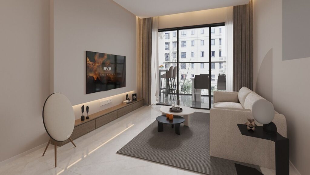
| Greys and Greiges | – Neutral blends of grey and beige.
– Timeless, sophisticated, and modern. – Create a peaceful, understated backdrop. – Highlight artwork or decorative elements beautifully. – Seamlessly blend with other colours and materials for a cohesive look. |
As we welcome 2025, Singapore’s interior design landscape is set to be transformed by a fresh and inspiring colour palette. This year’s trends strike a perfect balance between personal expression and modern elegance, featuring soothing earthy tones, bold jewel hues, and deep blues. Beyond aesthetics, the right colours can enhance natural light, create spatial depth, and reflect individual style. Whether you’re refreshing your space with soft pastels or adding a touch of luxury with rich tones, these trends offer endless possibilities. Step into the world of 2025’s interior design and discover how to infuse your home with colour, comfort, and sophistication.

Are Earthy Tones a Good Choice for Homes in Singapore?
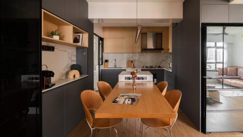
Earthy tones are becoming more popular in homes throughout Singapore, and this trend looks set to continue as homeowners embrace warm, natural hues that create a sense of tranquility and connection to nature. These colours include shades of brown, beige, terra cotta, and muted greens, creating a warm and natural feel. Earthy tones are perfect for creating a soothing and welcoming atmosphere, suitable for Singapore’s tropical climate. They go well with natural materials like wood and stone, giving a stylish and sustainable look.
There are many ways to incorporate earthy tones into your home. You could choose furniture or decorative items in these colours to refresh your space without needing a complete renovation. Muted earth tones can also be used on walls to create a calm atmosphere without being too overpowering. By using these colours wisely, homeowners can achieve stylish results without spending too much money, as suggested in affordable interior design ideas.
Another benefit of earthy tones is their versatility. They suit a variety of design styles, whether minimalist, bohemian, or industrial. Homeowners can start small, such as repainting a feature wall or adding earthy textiles, to see how these colours fit with their existing decor. A phased approach ensures a seamless transition and prevents financial and logistical strain.
Choosing the right shade within the earthy spectrum is key to achieving the mood you desire. For example, light browns or beiges can create a cosy setting, while darker shades like burnt sienna add depth and drama. Understanding colour psychology can help ensure the shades align with personal preference and the desired feel of the space.
How Does the Use of Bold Blues Affect Interior Spaces?
Bold blues are becoming a favourite choice for adding a striking touch to interior spaces. Popular shades include royal or navy blue, known for evoking sophistication and luxury. Although blue is generally associated with calmness, bold variations give off strong energy that can make a room vibrant and full of character.
To avoid overwhelm, it’s crucial to balance bold blues with neutral shades like white, grey, or earthy tones. This can help soften their impact and works best in creating a focal point or accent wall. Bold blues in art pieces can also transform a plain room into one that attracts admiration.
Bold blue hues are suitable for various interior design themes. They can be tailored to fit modern, classic, or even coastal settings. Adding natural textures or materials complements the serene vibe these shades often bring. For instance, a home near the coast could use blue to achieve a relaxed beach atmosphere.
Besides aesthetics, bold blues have a practical advantage—they hide dirt and stains quite well, which is particularly helpful for households with children or pets. However, blending these with lighter shades is essential to avoid a dark and uninviting appearance. For more inspiration on integrating vibrant hues, you might explore tips on cosy bedroom interior design ideas.

Can Pastel Shades Give a Modern Twist to Traditional Singaporean Homes?
Pastel shades offer a chance to modernise traditional Singaporean homes. These soft, muted colours, like pastel pinks, blues, yellows, and greens, offer fresh and youthful appeal. They can brighten interiors and create a feeling of calmness and openness, making them perfect for smaller living spaces.
Pastels are incredibly versatile and fit into many design styles, from minimalist to eclectic. Their adaptability means these shades can redefine spaces without clashing with existing decor. For those thinking about minimalist interior design in Singapore, pastels deliver a touch of colour without losing the clean and simple lines that define minimalism.
Yet, using pastels too much can make a space feel sterile. It’s wise to balance pastels with neutrals or darker shades for a touch of maturity. Patterns on rugs, wallpaper, or fabrics can add visual interest and personalise the use of pastels.
Switching accessories like throws, curtains, and cushions seasonally is an easy way to keep using pastels fresh and dynamic. With tips from eclectic interior design, you can further explore how these elements contribute to a unique stylistic twist.

How Do Jewel Tones Enhance a Home’s Luxury?
Jewel tones boast rich and vibrant colours, like emerald green, sapphire blue, amethyst purple, and ruby red, which add a sense of luxury. These shades are usually best in spacious settings, where their boldness stands out without overwhelming the area.
In Singapore, homes of various sizes can benefit from the elegance jewel tones bring, aligning well with the idea of quiet luxury at home. To use jewel tones effectively, incorporate them selectively to let them shine as highlights within a neutral base.
Lighting is key for showcasing jewel tones; use a mix of ambient, task, and accent lighting to display these colours at their best.
Jewel tones are adaptable, fitting into modern or vintage themes. These colours equally carve spaces with their boldness, giving flexibility for different design preferences.

Why are Greys and Greiges Trending in Interior Design?
Greys and greiges (a blend of grey and beige) have become staples in interior design due to their neutral and timeless appeal. These shades reflect a sophisticated, modern style and can create a peaceful setting, suitable for fast-paced lifestyles in Singapore.
These hues offer versatility, serving as neutral backgrounds that highlight artistic elements. For long-term decor investments, like the best furniture pieces, choosing grey or greige ensures a classic aesthetic adaptable over time.
A major advantage of using these neutral colours is how they bridge rooms, ensuring seamless flow throughout a home. They also support pattern and material experimentation, perfect for introducing different textures.
Greys and greiges blend well with sustainable materials like wood, concrete, and metal, enhancing natural aesthetics without drawing attention. Choosing minor projects like repainting walls aids in familiarising with these colours before thorough commitment.
Choosing the right grey shade matters, as undertones can drastically change a room’s feel. Cool greys offer a contemporary aura, while warmer greiges exude warmth. Test several shades under actual home lighting to ensure an ideal fit. For ideas on creating an open and cohesive living area, consider exploring the open concept living room approach.

FAQ
What are earthy tones, and why are they a good choice for homes in Singapore?
Earthy tones refer to warm, natural colours such as browns, beiges, and muted greens. These shades create a soothing and welcoming atmosphere, which is ideal for Singapore’s tropical climate. They work well with natural materials like wood and stone and can easily be combined with modern elements to keep the design stylish and fresh.
How can bold blues enhance the look of a room?
Bold blues, such as royal or navy blue, bring a striking energy to a room. They convey both sophistication and vibrancy. Best used as accent colours or focal points, they can complement neutral and warm tones. Moreover, bold blues are practical as they can hide dirt and stains effectively.
Are pastel shades suitable for modernising traditional Singaporean homes?
Yes, pastel shades are excellent for modernising traditional homes. These soft, muted colours bring a fresh and youthful appeal and can easily brighten and open up living spaces. Pastels are versatile, fitting various styles from minimalist to eclectic, and can be layered with textures to add depth and personality.
What effect do jewel tones have on a home’s decor?
Jewel tones like emerald green, sapphire blue, and ruby red add a luxurious feel to a home. They are best utilised as vibrant focal points and work well with rich textures such as velvet and satin. Pairing jewel tones with gold or silver accents enhances their elegance and adds sophistication.
Why are greys and greiges trending in interior design?
Greys and greiges are popular because of their neutral, timeless appeal. These colours offer a sophisticated, modern look that creates a calm, peaceful environment. They are incredibly versatile, serving as backdrops that highlight other design elements, and blend seamlessly with various colours and materials for a cohesive design.

Are you looking to upgrade your space? Look no further! Drop us an enquiry at media@redbrick.sg and let us help you transform your home into a smart and efficient living space. Our experts are here to assist you in finding the perfect smart home devices to suit your needs and enhance your lifestyle.
Designing your dream home can be an exciting journey, but it can also be overwhelming. With so many options and styles available, it can be challenging to decide what is best for you and your family. However, by considering factors such as functionality, color palette, furniture, materials, and personal style, you can create a space that is not only beautiful but also practical and comfortable.
When it comes to achieving a successful interior design project, choosing a provider with a rock-solid reputation and exceptional skills is paramount. At Redbrick Homes, we understand that inspiration is key. That’s why our top-quality interior design partners are ready to wow you with beautiful, personalized spaces brimming with exceptional Singaporean ideas.
Remember to take your time, do your research, and work with a professional if needed. With the right interior design choices, you can transform your house into a dream home that you’ll enjoy for years to come.