
In Singapore, “minimalist” often gets reduced to a look: light colours, clean carpentry, fewer objects on display. The harder part is building a home that stays calm when real life happens, when things are left out, when routines are messy, and when the space has to work from morning to night.
This Punggol 4-room HDB was designed by Hatch Design Studio for a modern young couple with a cat. They wanted a calm, uncluttered home with durable materials and bright kitchen and dining spaces, while avoiding visual clutter and dark or heavy finishes.

Project snapshot
Home type: 4-room HDB in Punggol (approx. 102 sqm)
Reported budget: approx. S$110,000
Interior designer: Hatch Design Studio
The brief
The homeowners wanted a calm, uncluttered home that feels bright and easy to maintain, without visual clutter or dark, heavy finishes.
The approach
The renovation was guided by long-term livability. Instead of adding more design elements, Hatch focused on simplifying the layout and design language, integrating concealed storage, and planning clear circulation paths so daily movement feels smooth rather than interrupted.

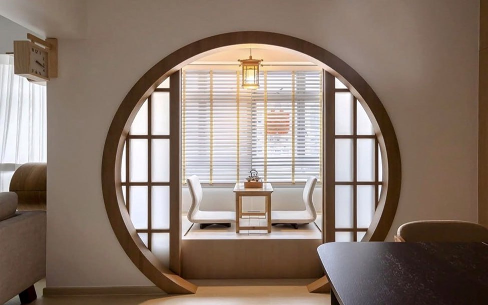
The one move that set the tone: a circular opening between zones
The circular opening is the clearest expression of the home’s approach. It sits between zones like a soft separator, not a hard boundary. The effect is subtle but important: you still experience distinct areas, but movement through the home feels continuous. There are fewer “stops”, fewer moments where your eye hits a wall and resets.
This is also why the opening works better than a typical room divider or a full-height partition. It gives the home structure without reducing light, and it creates a moment of design interest without relying on ornament or colour tricks.
It looks simple in photos, but curved elements are rarely simple to execute. Proportion, alignment, finishing, and junction details matter more because the curve becomes the visual reference point. When it is done well, it reads as effortless. When it is not, it becomes the one thing you cannot unsee.
Here, the curve is not used to impress. It is used to regulate the pace of the home.

A bright kitchen that is designed for daily wear, not just first impressions
The homeowners wanted a kitchen that felt bright and clean, but also practical. This is where many renovations in Singapore become contradictory: homeowners want a light kitchen, but they also want it to stay looking good with heavy use. The materials you choose decide whether the kitchen still feels “fresh” one year in.
Here, the material choices lean toward durability and maintenance: sintered stone is used for work surfaces where heat and staining are real concerns; laminates are used where everyday wear should not become a constant worry; and aluminium cabinets are used at the kitchen basin area for moisture resilience.
This combination is not about chasing premium materials for status. It is about choosing finishes that reduce long-term friction. The best low-maintenance kitchens are not the ones that look “most expensive” on day one. They are the ones that still feel easy on day 300.
One of the three hero moments Hatch points to is the kitchen and island counter. The intention was not just brightness, but an efficient layout that stays durable over time. The aluminium at the basin area is also matched carefully to the carpentry so the functional decision does not break the visual calm.

Calm through concealment: the dining door and the reduction of visual noise
A concealed dining door may sound like a small detail, but it reveals a consistent mindset: control what you see, and the space will feel calmer without you having to “style” it.
When doors blend into the wall plane, they reduce visual interruptions. The dining area reads as cleaner because your eye is not constantly catching frames and outlines. In compact homes, this matters because visual clutter builds faster than people expect.
This is one of the quieter decisions that homeowners tend to appreciate most after move-in. It does not show up as a “feature”, but it affects how often the home feels mentally messy.
Storage as a system, not a collection of carpentry items
Most homeowners talk about storage in terms of quantity. In practice, storage only works when it follows behaviour. If a home does not plan for where items naturally land, countertops become dumping zones and “minimalist” becomes a stressful performance.
This home treats storage as an organising system. Frequently used items are placed where they are naturally reached. Visual zones that should feel calm rely more on concealed storage. Open shelving is used with restraint so it remains intentional, not accidental.
A good way to think about this is simple: design for your real routines, not your ideal routines. Keys, bags, receipts, chargers, bottles, mail. If these are not given a home, they will take over the most visible surfaces.

Lighting that supports mood without sacrificing function
Lighting often gets treated as an afterthought, but it is one of the most common reasons a “bright” home feels harsh at night. A single bright ceiling light makes everything equally lit, which is efficient but not comfortable.
This home uses a more layered approach. Ambient lighting supports a softer living and dining experience. Task lighting keeps functional areas like the kitchen practical. This is the difference between a home that looks clean in the day, and a home that feels calming at night.

The trade-off that makes the home work
A home like this only holds together because it is disciplined. Once you commit to a calm interior, you cannot rely on “extra” features to carry the design. The curve, the concealed door, and the material palette become more important because everything else is intentionally quieter.
The implied trade-off is also clear: fewer competing design moments, fewer materials, fewer visual interruptions. In exchange, the home gains coherence, and coherence is what makes a space feel premium over time.
What homeowners can take from this renovation
If you are renovating a 4-room HDB, this home offers three practical lessons. Start with flow. Zoning is not just about walls. It is about how you move and where the eye rests. Choose finishes that forgive your lifestyle. Brightness is easy. Brightness that stays pleasant is a materials decision. Reduce visual noise before adding “features”. Calm is usually created by what is removed, not what is added.

FAQ
How do I make my HDB feel calmer without major hacking?
Focus on zoning and visual noise. Use softer separators, simplify the material palette, and plan storage for daily clutter hotspots.
Is sintered stone worth it for a Singapore kitchen?
It is most worth it when you use it where heat and staining happen. The value comes from reducing long-term maintenance stress, not from using it everywhere.
What is one lighting decision that improves comfort immediately?
Layer your lighting. Keep an ambient layer for mood and a task layer for function. Avoid relying on one bright ceiling light for the whole space.
About Hatch Design Studio
At Hatch Design Studio, we believe that your living or working space should not just be a place, but a reflection of your unique personality and style. Our team of passionate and creative interior designers is dedicated to transforming your vision into reality, creating spaces that are not only visually stunning but also functional and comfortable. Our Approach We understand that every client is different, and that is why we tailor our approach to meet your specific needs and preferences. Whether you are looking to redesign a single room or your entire home or office, our designers will work closely with you every step of the way to ensure that the final result exceeds your expectations.


